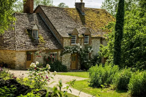
Whether you want to create a warming cosy sanctuary or an eye-popping space that instantly energises and uplifts, there’s a paint that’s right for you.
 Paint’s fortunes have ebbed and flowed – from the lead-heavy dark days of the Victorians to the magnolia years of the 1980s and the feature walls of the 00s. Now companies are reinventing paint, driven by demand for warmer and bolder colours and for paints that are ethically produced and environmentally friendly. Ben Sturges, Director at Graphenstone observes, “Customers want to keep toxins out of their homes.” The company’s natural mineral-based paints are harm free and almost entirely odourless, with trace VOCs of less than 0.1 per cent, highly pigmented, they offer rich, deep colours with a luxurious, velvety finish.
Left: image courtesy of Pantone
Paint is a great decorating option for many reasons. It’s versatile and can be used on almost any surface – walls, woodwork, ceilings and even furniture. Easy to apply, it doesn’t require any specialist skills and allows you to dramatically change the look and feel of a room. As interior designer Nicky Percival says, “Paint is durable, versatile, and easy to change when you want a refresh.” A recent trend involves drenching your room with colour – painting spaces in a single shade from floor to ceiling, including skirtings, windows and sills – and also double-drenching, which combines two or three related hues in the same treatment. If you want something really impactful you could extend your drenching to include the ceiling, for what Nicky calls “the jewel-box effect”.
Current colour trends include shades of brown and earthy tones – Pantone’s colour for 2025 is Mocha Mousse which, they say “captures a global mood of connection, comfort and harmony”. Heritage brand Farrow & Ball has just launched 12 new colours to its signature palette including a deep terracotta (Marmelo, named after the quince used in marmalade) and a warm beige (Scallop), alongside Reduced Green (which some might see as brown) and Sizing, a neutral blue named after household starch. Of the inspiration for the new shades, Joa Studholme, Colour Curator for Farrow & Ball, says, “Over the last few years we’ve relished living with colour. It’s opened our eyes to all the shades surrounding us… the treasures right under our noses,” or in the case of Duster, an aged yellow named after that familiar cloth, in our cleaning cupboards.
Cassandra Ellis launched Atelier Ellis in 2018 to “help people tell the stories of their home.” Bio-based and breathable, the paints are, “neither minimalist nor traditional, with colours deeply rooted in the natural world,” she says. Shades include earthy green Lily Lawn, creamy Sunday Suppers and chalky faded Aged Black.
For something a little less sedate, Bristol Paint has a range of eye-popping colours such as rich Tomato 1041, Fluorescent Yellow 1068 and deep Ultramarine 1035. The company has worked with the Royal Opera House, Dior and Louis Vuitton and was behind the shocking pink interiors in the movie, Barbie. “People see the blue of Yves Saint Laurent’s Jardin Majorelle in Marrakech and come to us to for our Ultramarine 1035, which customers say is as close as you can get,” says Bristol’s Director Steven Jennings. The company can also colour match: “We match by hand, the old-school way, for the best match. We can also produce extremely bright and metallic colours that most conventional suppliers can’t achieve,” says Steven.
Whether you’re going for big and bold or muted and soothing, paint experts recommend doing a test patch on various walls of your room, as lighting – both natural and artificial – can drastically alter how a colour appears, and shades will look different throughout the day.